Now, I’m no professional graphic designer by any means, but I do dabble in design work occasionally for personal projects or if I get special requests from family and friends. This summer seemed to be one of those seasons where I had more requests than usual!
Sophisticated Birthday Party Invites
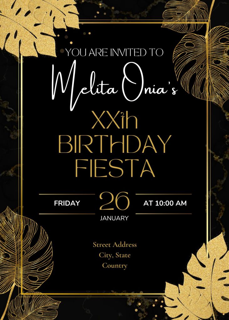
The first came from my aunt, who asked me to design a digital invite for a birthday party. The venue would be in a tropical location, so I was able to find a standard template on Canva that had palm tree leaves that would fit the theme perfectly. The guest of honor’s favorite colors are silver and gold, and she’s often described as “sophisticated and classy,” so the black and gold color palette with a font reminiscent of The Great Gatsby seemed to be the best combo for this purpose.
If I had to change anything, it would be the font for the age (XXth). That “T”-not “T” was starting to get to me, but my aunt loved it as-is, so I left it alone. I also could have done more to incorporate silver, maybe in place of the white font, but it would have made the text a little harder to read against the dark background. But overall, I’m pretty happy with how this turned out–and apparently, so is the birthday girl!
Dark Boho Save the Dates
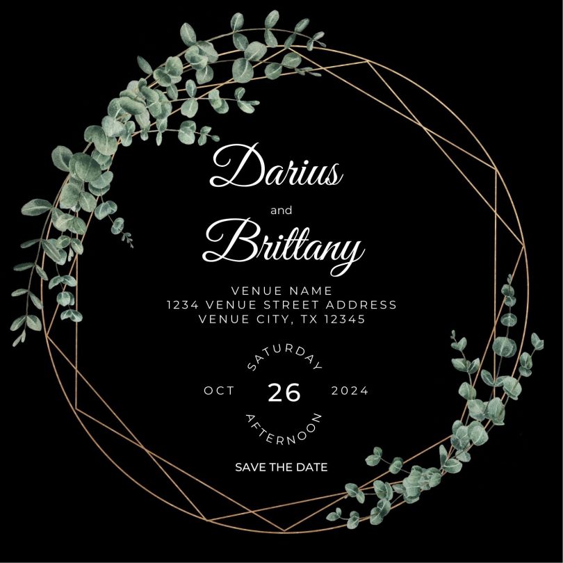
Next, we have the bestie’s Save the Dates for her upcoming nuptials! The colors are eucalyptus green and steel gray, with black as the accent color, and as you can gather from the final design below, leaves will definitely be involved in the floral arrangements and decor.
She’s leaning toward a dark boho aesthetic for the wedding, so we decided on the geometric ring wrapped in eucalyptus. The back of the Save the Date (not pictured here) is a sage-like green that matches the color of the leaves here and features a QR code that goes to their wedding website when scanned. (The site URL is underneath the QR code for their not-so-tech-saavy guests.)
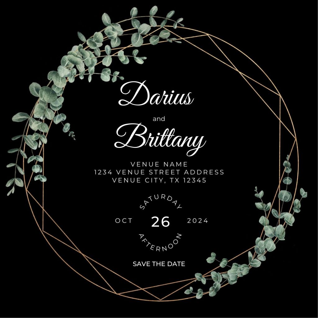
If I were to change anything here, it would be the placement of the “save the date” text, which–admittedly–wasn’t there in the original design. (Yup, that’s right, we both didn’t realize those three keywords were missing for these Save the Dates!)
Other than that, the final version is pretty simple, so there wasn’t much I could complain about. However, despite being simplistic, I actually had a hard time designing around the eucalyptus ring; it took a few tries before I could get the text and frame to get along so they would both be easily visible and centered. It was definitely a learning experience!
