digital save the date, cropped

Design Dump: Navy & Rose Gold Wedding Stationery

In this Design Dump, we’re going back in time to take a look at a project near and dear to my heart: stationery for my wedding!

Although I used a professional design service for the wedding invitations, I took it upon myself to create my own Save the Dates, Night Before invites, and day-of signage (both for cost-saving and creative expression purposes). Shout out to Canva for its user-friendly platform and amazing print services to help make this possible!

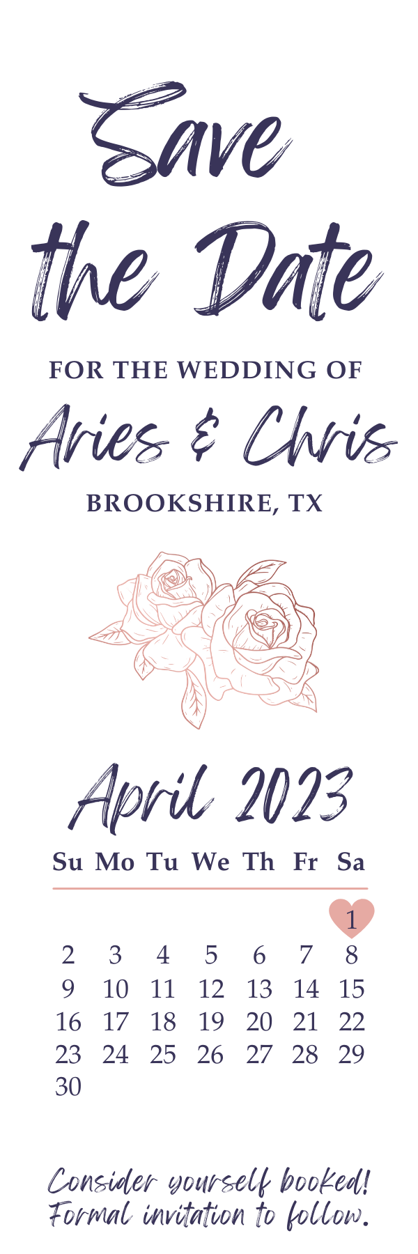
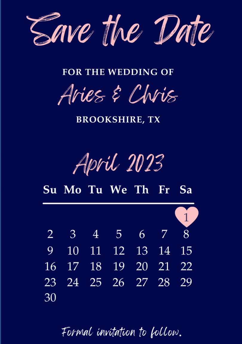
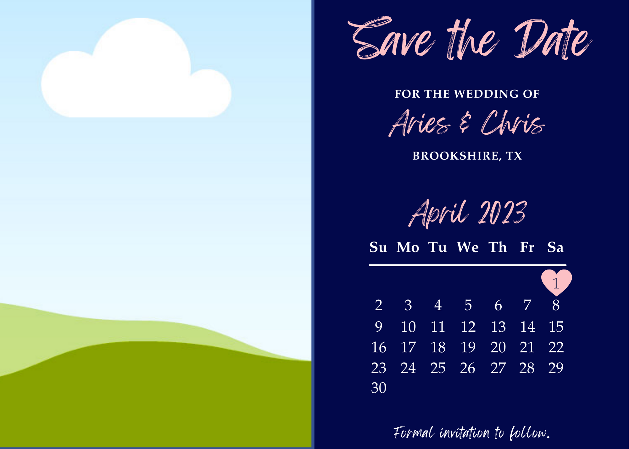
Being the bookworm I am, I had to make Save the Date bookmarks. Not only are they a unique concept, but you can hold onto them as memorabilia for years. Ultimately, I went with a two-sided bookmark design, leaving room for a hole punch at the top where I could tie a color-matching tassel.

Because of the size constraints that come with designing a bookmark, I had to be strategic about how much information to include without making things too cluttered or sparse. Of course, Save the Dates are meant to be a “Hey, heads up! There’s a wedding happening on this date at this location. Plan accordingly.” That said, I kept things to a minimum, limiting info to the date and location.

Text

I didn’t want to use the generic elegant cursive font typically used for wedding stationery. I’ve always been a fan of “handwriting” fonts because they seem more natural, so Playlist Script was the way to go for the headers/titles. For readability, I kept the rest of the text in a standard serif font.

Design

When it comes to date formats on Save the Dates, I’ve always liked the idea of a mini calendar. It’s also easy to work with within the constraints of a bookmark. After adding key information, I realized there was a lot of white space left, so I added the rose graphic as a play on the “rose gold” concept. (Fun fact: It’s very difficult to nail the exact color of rose gold in a matte design, so we had to settle for a blush pink as an alternative.) The other side of the bookmark was a full image of one of our engagement portraits.

Finally, my husband is a pun person, so naturally, a requirement for this bookmark was to include a book-related pun somewhere… “Consider yourself booked!” worked perfectly.

I also designed a complementary digital Save the Date to send to guests that we didn’t have mailing addresses for, but we ended up sending it out to our full guest list via email/text to account for any mail mishaps.

The right half contained the same information as the bookmark, with slight tweaks to the text, while the left utilized the same engagement portrait.

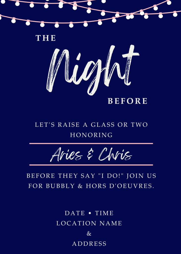
Because the full bridal party planned to be at the venue all day leading up to the ceremony, our “rehearsal” happened that same morning. So, we labeled the dinner for the night before… well, “The Night Before.”

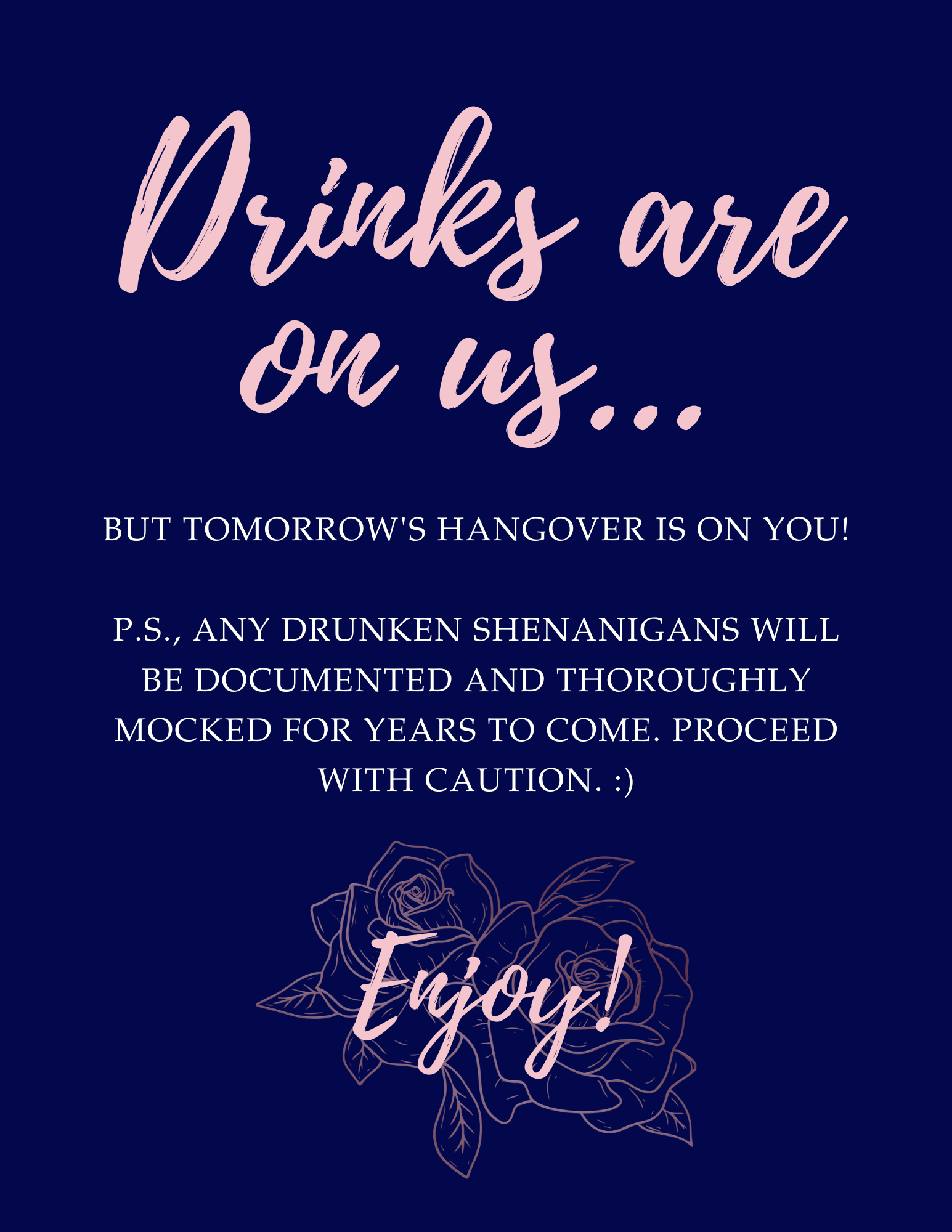
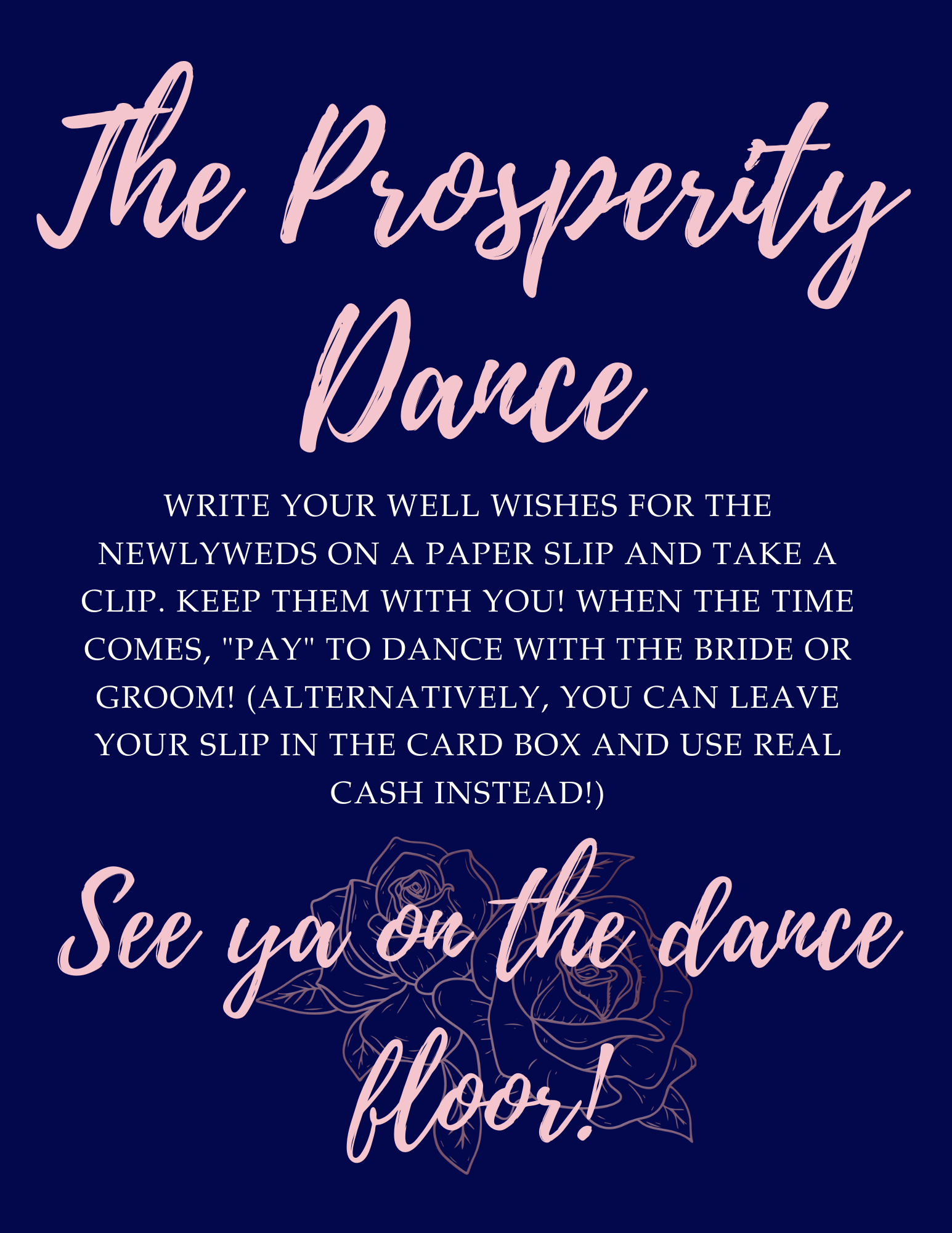
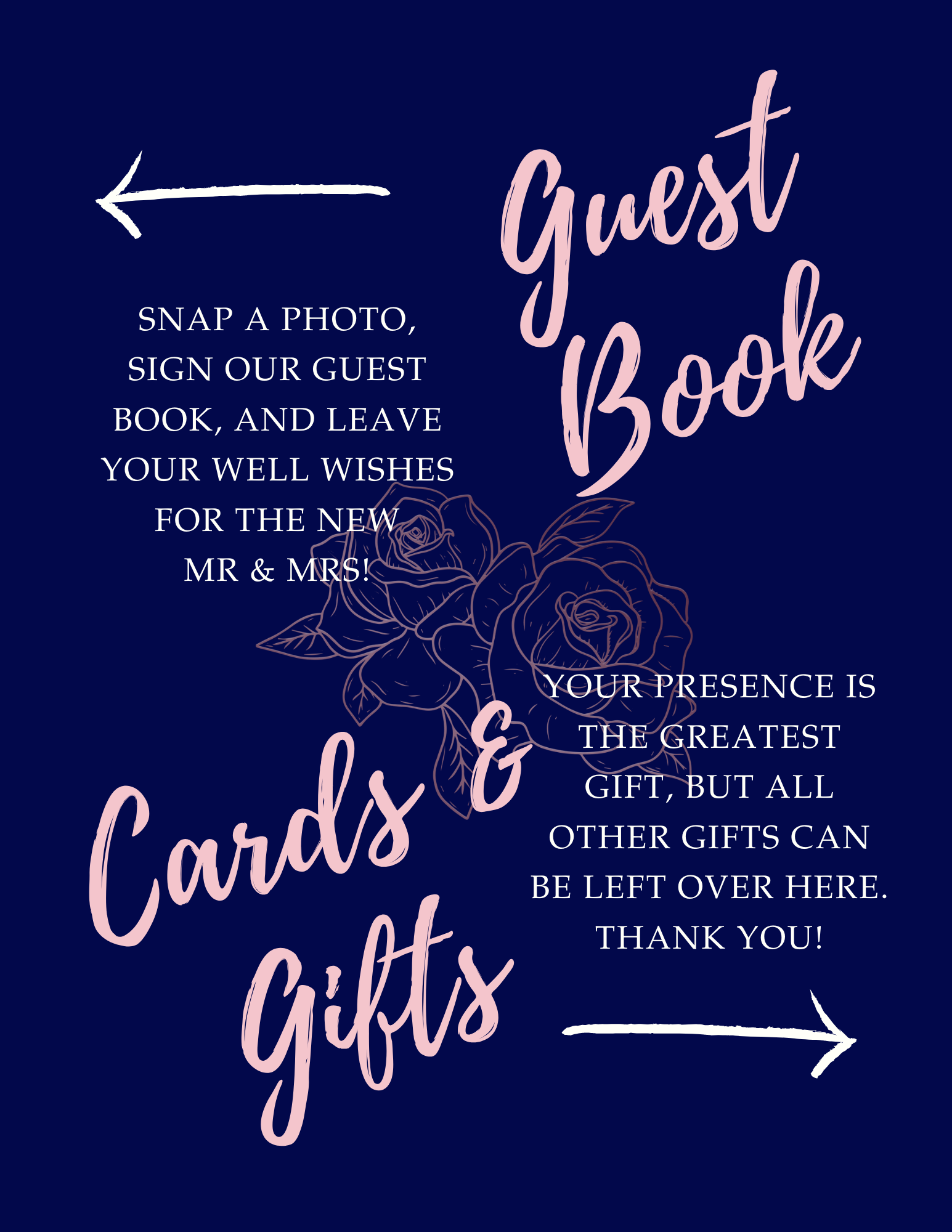
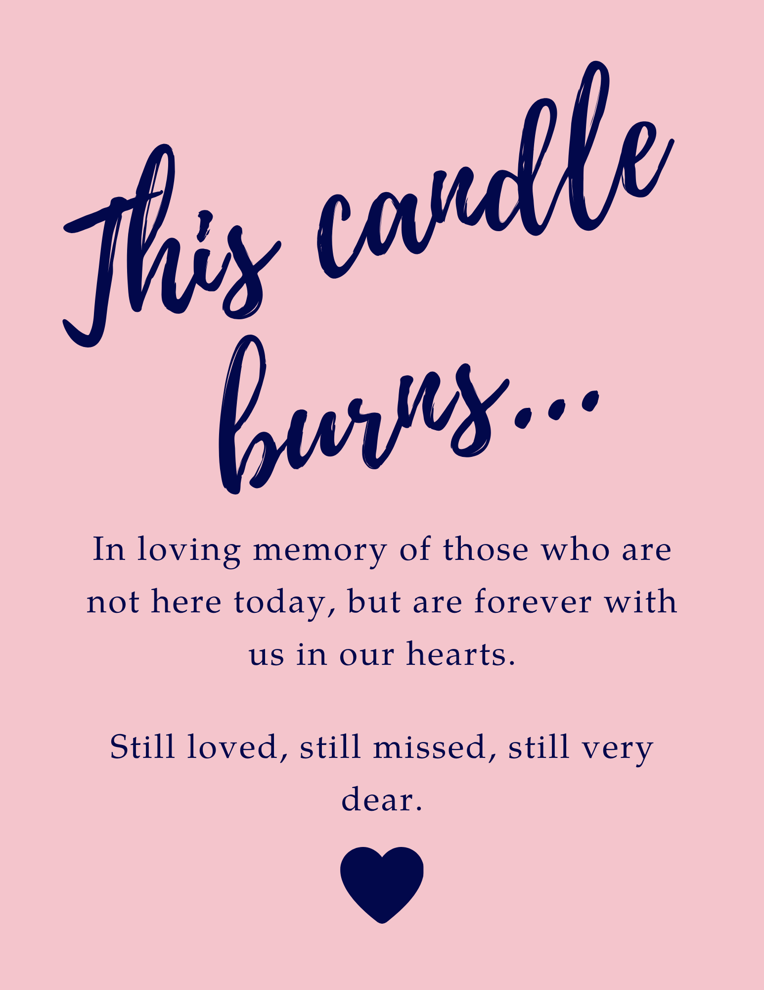
Like the Save the Dates, I wanted to keep this simple with only key information: the date, time, and location (and, of course, the subtle hints that there would be appetizers and drinks available). The font and colors were purposely matched to the theme of the Save the Dates, as you’ll also see with the signage below. (Consistency is key!)

This invitation was only extended to the bridal party and immediate family, so we went with the digital-only route.

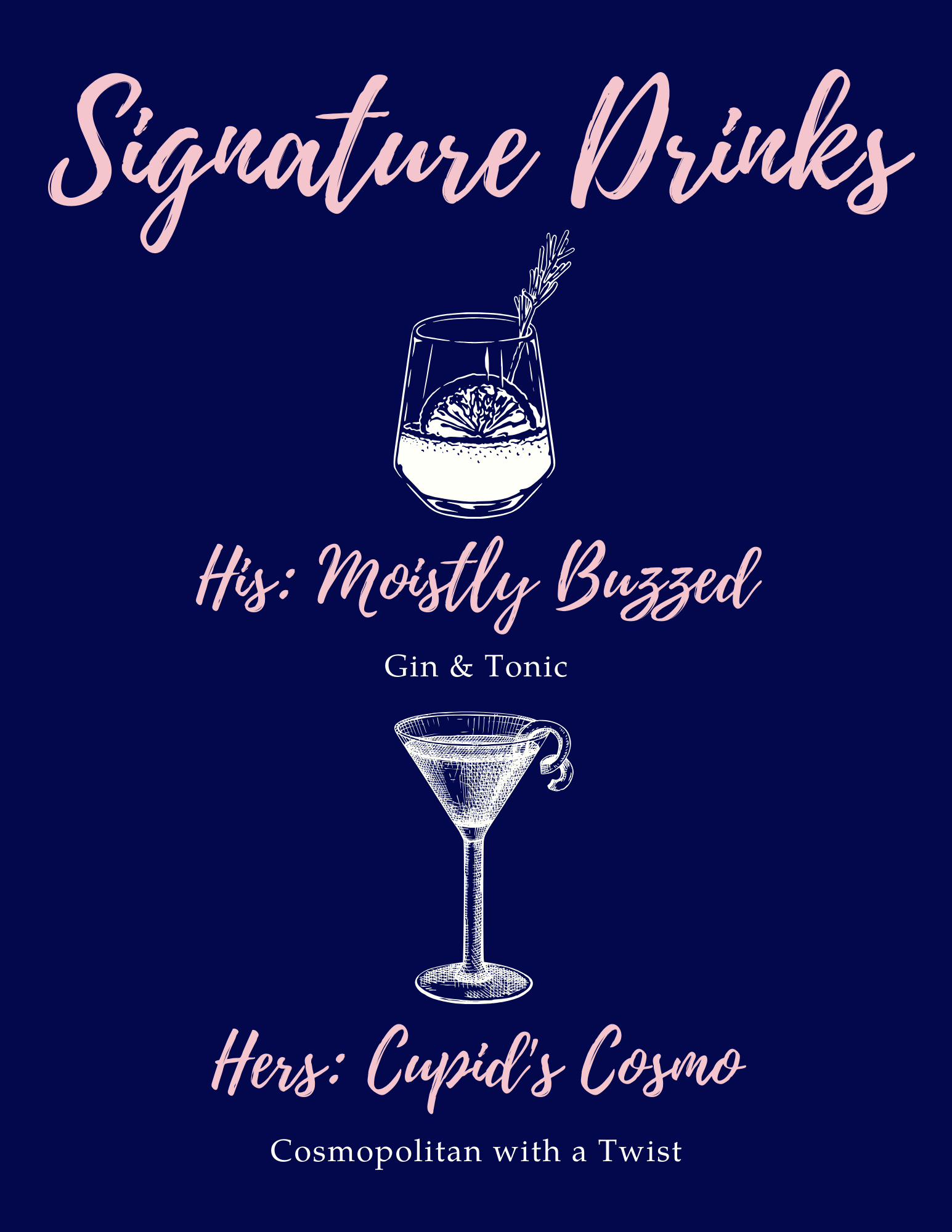
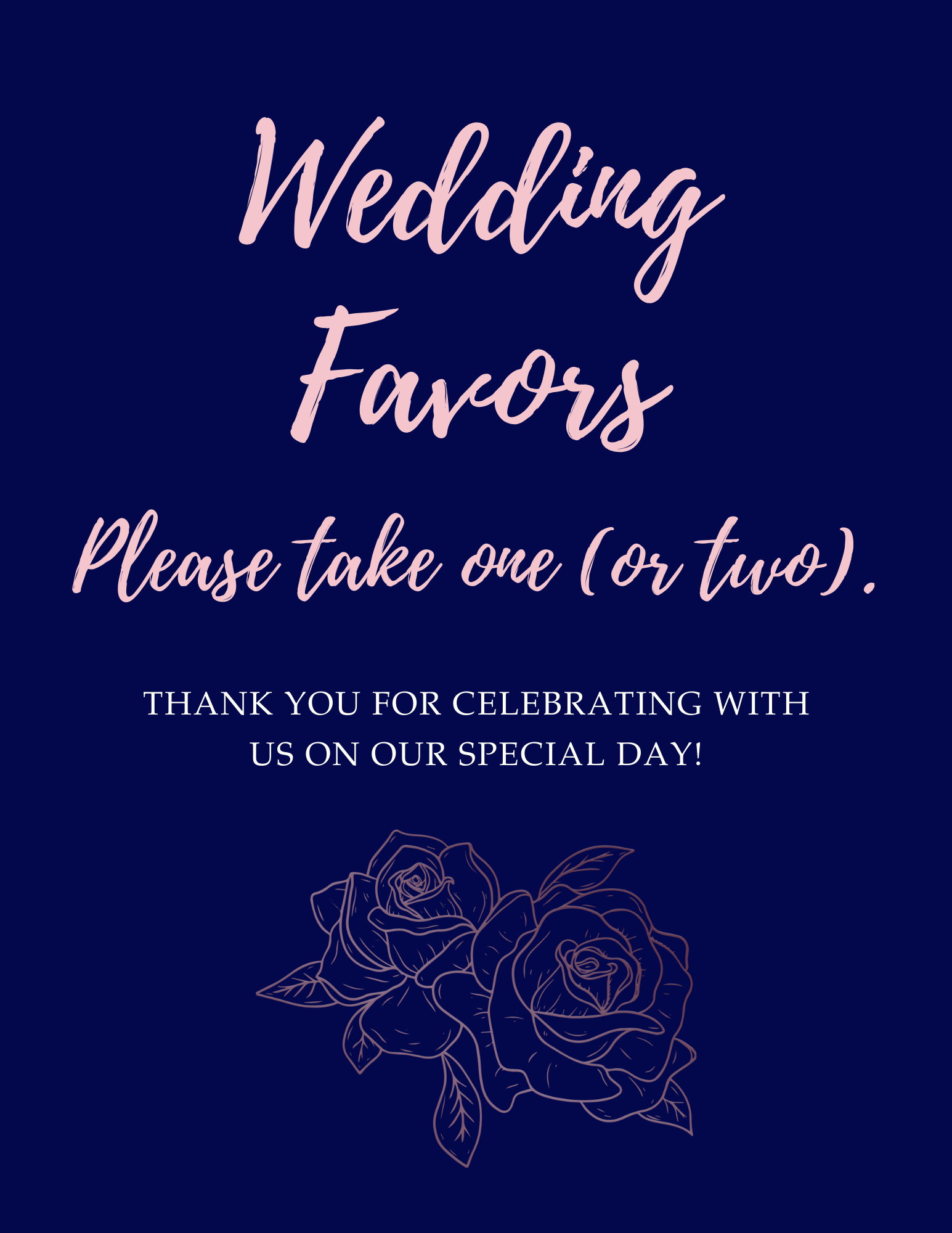
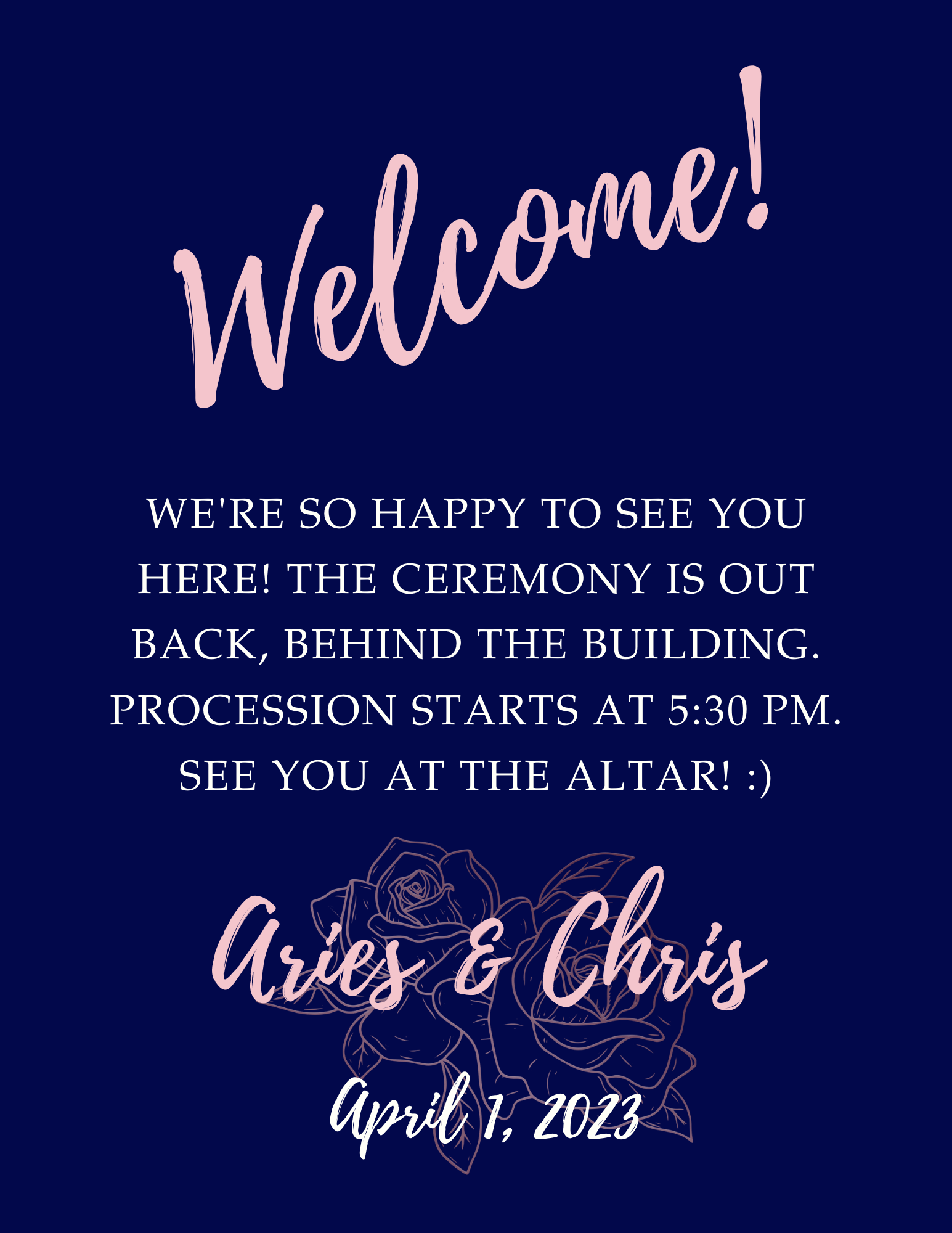
Finally, we have our day-of signage! These were all sized to fit 8.5 x 11″ frames, which were placed on stands throughout the interior of the venue to help direct guests accordingly.

dark boho save the date invite

Design Dump: Sophisticated Birthday Party Invite, Dark Boho Save the Dates

Now, I’m no professional graphic designer by any means, but I do dabble in design work occasionally for personal projects or if I get special requests from family and friends. This summer seemed to be one of those seasons where I had more requests than usual!

Sophisticated Birthday Party Invites

The first came from my aunt, who asked me to design a digital invite for a birthday party. The venue would be in a tropical location, so I was able to find a standard template on Canva that had palm tree leaves that would fit the theme perfectly. The guest of honor’s favorite colors are silver and gold, and she’s often described as “sophisticated and classy,” so the black and gold color palette with a font reminiscent of The Great Gatsby seemed to be the best combo for this purpose.

If I had to change anything, it would be the font for the age (XXth). That “T”-not “T” was starting to get to me, but my aunt loved it as-is, so I left it alone. I also could have done more to incorporate silver, maybe in place of the white font, but it would have made the text a little harder to read against the dark background. But overall, I’m pretty happy with how this turned out–and apparently, so is the birthday girl!

sophisticated black gold birthday invite

Dark Boho Save the Dates

Next, we have the bestie’s Save the Dates for her upcoming nuptials! The colors are eucalyptus green and steel gray, with black as the accent color, and as you can gather from the final design below, leaves will definitely be involved in the floral arrangements and decor.

She’s leaning toward a dark boho aesthetic for the wedding, so we decided on the geometric ring wrapped in eucalyptus. The back of the Save the Date (not pictured here) is a sage-like green that matches the color of the leaves here and features a QR code that goes to their wedding website when scanned. (The site URL is underneath the QR code for their not-so-tech-saavy guests.)

If I were to change anything here, it would be the placement of the “save the date” text, which–admittedly–wasn’t there in the original design. (Yup, that’s right, we both didn’t realize those three keywords were missing for these Save the Dates!)

Other than that, the final version is pretty simple, so there wasn’t much I could complain about. However, despite being simplistic, I actually had a hard time designing around the eucalyptus ring; it took a few tries before I could get the text and frame to get along so they would both be easily visible and centered. It was definitely a learning experience!

the things they carried cover redesign

Publishing Design: The Covers of 3 Books, Reimagined

For my masters program, I had to recreate the covers of three novels of my choosing, considering their theme and length. Since this was the culmination of the Publishing Design course, I had to carefully select various elements, ranging from font to margin width, to best represent the book. And after many–many hours of brainstorming and relearning how to use Adobe InDesign, these were the results.

Disclaimer: The following designs were made as part of a school project–a recreation of the original novel’s cover and interior design–and therefore not produced with or for the sale of the book; rights to any original artwork and text belong to the author.